

I worked on this project as a self-initiated pet project in order to go through the full cycle of mobile interface design in practice — from analytics and product logic to final UI. For me, it was the first conscious experience of working with a mobile product and iOS guidelines without relying on ready-made templates or shortcuts.
The work was carried out iteratively, with regular reviews and discussions of design decisions with a mentor. The main goal of the project was not to produce “pretty screens,” but to understand how a product is built as a system.
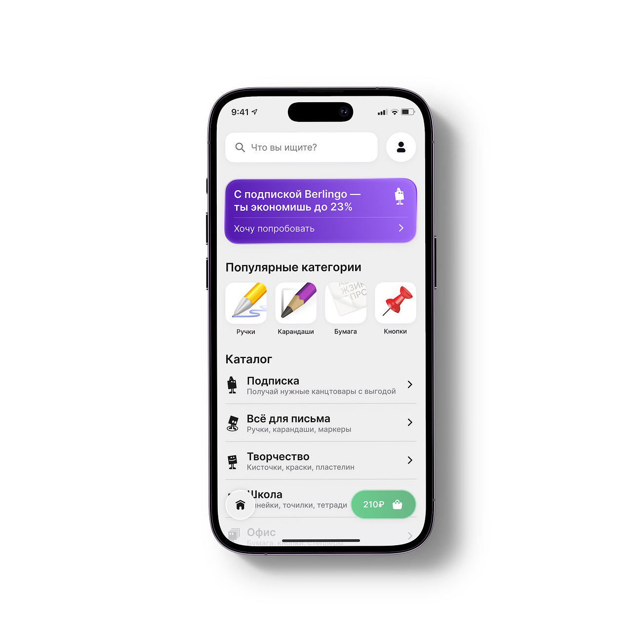
At the start, the project had neither a finished application nor a defined product logic. I deliberately took Berlingo’s existing brand identity as a foundation and did not attempt to reinterpret it. The task was to carefully adapt the brand’s visual language to a mobile interface and build a clear and logical product structure.
Within the project, I went through the following stages step by step:
— competitor and market analysis;
— product hypothesis formation;
— business model definition;
— user scenario design;
— working with iOS Human Interface Guidelines;
— icon and UI component design;
— mobile UX/UI assembly.
Competitor analysis
During the research phase, I analyzed the key solutions used by competitors and identified recurring problems:
— visually outdated interfaces with aggressive contrasts;
— overloaded screens due to excessive outlines and decorative elements;
— lack of clear information hierarchy;
— an excessive number of screens without real product value.
This analysis became the reference point for all subsequent decisions: the interface had to be calm, readable, and structured around user scenarios rather than isolated features.
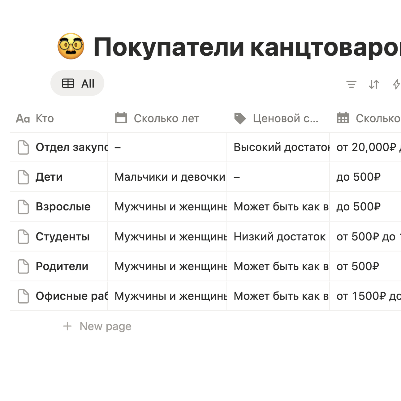
Analytics and structure
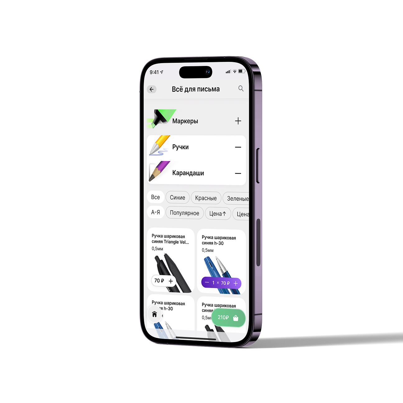
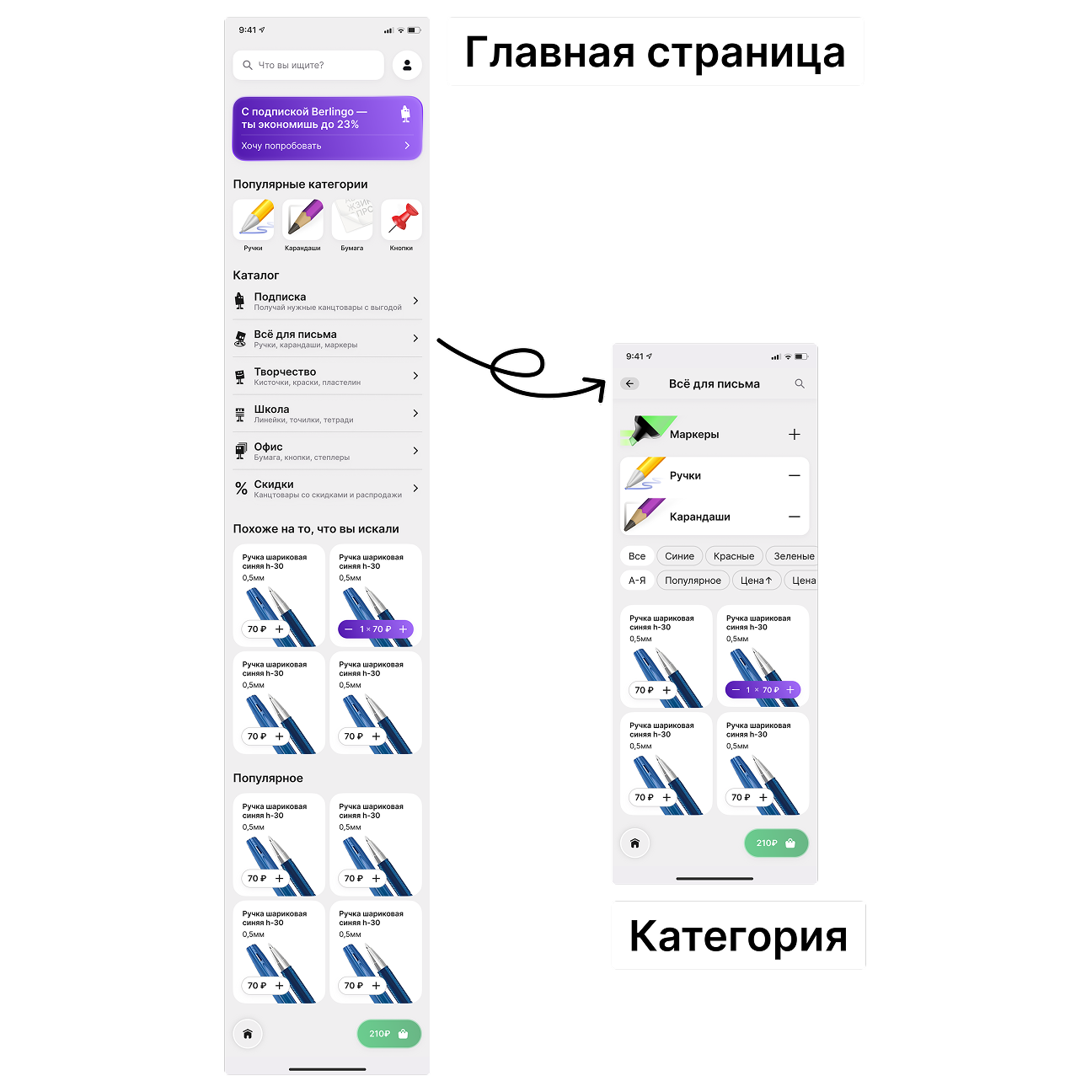
At the initial stage, I defined the base structure of the future application and a set of user scenarios. I worked through user stories, potential growth points, and features that could be scaled in the future.
The task at this stage was simple in formulation but complex in practice — not to build unnecessary functionality. I deliberately discarded features that did not strengthen the core scenario and continuously tested decisions for necessity.
Product business logic
Before starting interface design, I outlined a base business model built on the analysis of target audience segments. It served as a framework for product decisions and helped filter out unnecessary features already at the prototyping stage.
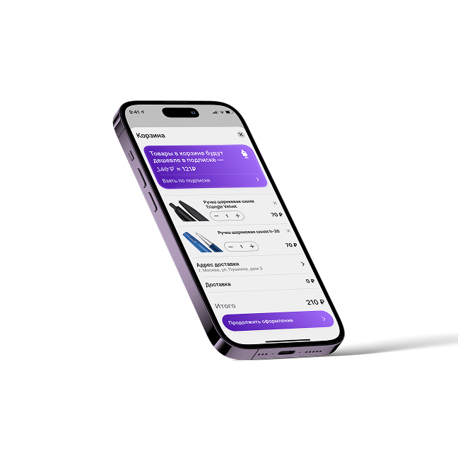
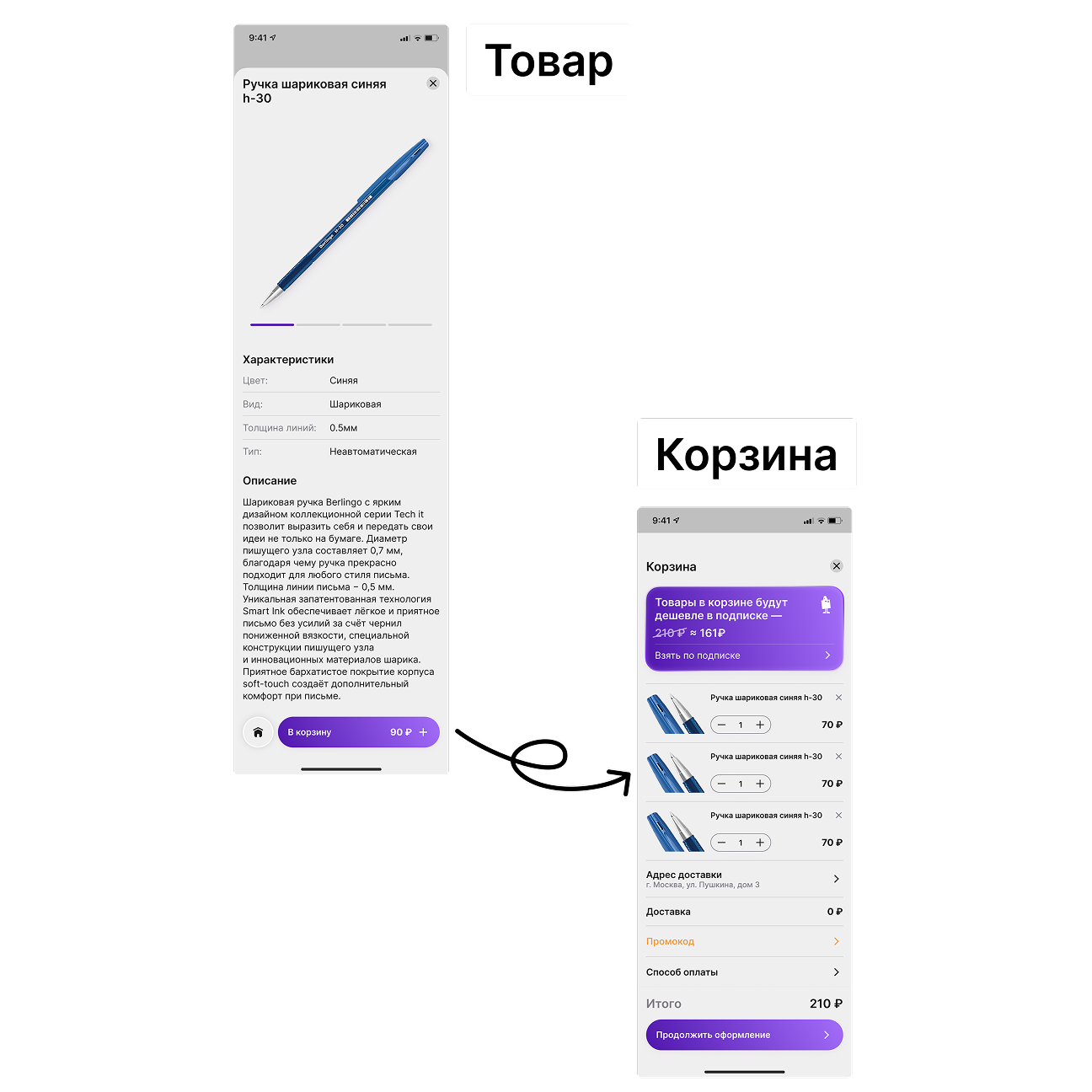
The main product processes were built around marketing, delivery, and pricing. I approached the product not as a retail storefront, but as a subscription-based service where convenience of repeat purchases and reduced cognitive load become key.
Monetization
The monetization model is built around a stationery subscription. The subscription was considered a more convenient and cost-effective alternative to one-time kits and traditional retail.
Users can choose a preferred delivery option: parcel locker, nearby store pickup, or home delivery for a small additional fee. Prices within the subscription are lower than retail but do not drop below wholesale levels. The difference compared to retail is around 10 %.
The launch strategy assumed gradual price growth: discounted pricing at the start and promotional offers to attract early users, followed by a progressive increase.
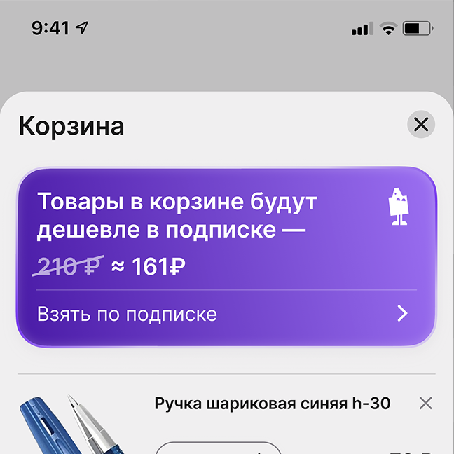
For users, the subscription provides predictability and control. For a fixed monthly fee, they receive a service bundle that can be flexibly adjusted — expanded or reduced without additional capital expenses.
For the business, the subscription model creates long-term user relationships and a stable revenue stream. It is not a one-off transaction, but an agreement on continuous interaction.
Thanks to these long-term relationships, the subscription becomes a more convenient and economical alternative to kits and, even more so, traditional retail.
Prototyping
After analytics and business modeling, I moved on to prototyping. Early screens were built as quick hypotheses and regularly reviewed. Changes were introduced iteratively, without attempts to “get everything right” from the start.
Throughout the process, I consciously followed the principle of Occam’s razor: if an element does not strengthen the core scenario, it should not exist. This helped remove unnecessary functionality before reaching the visual design stage.
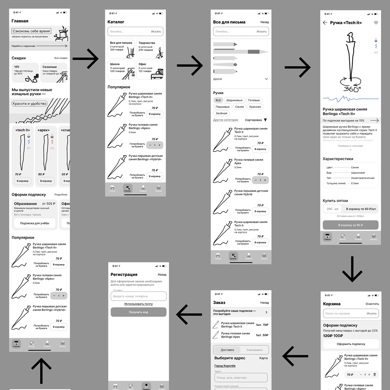
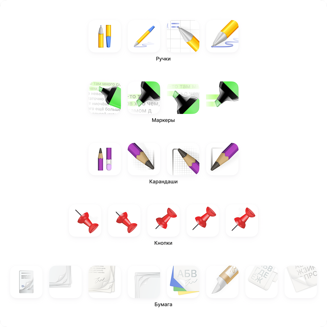
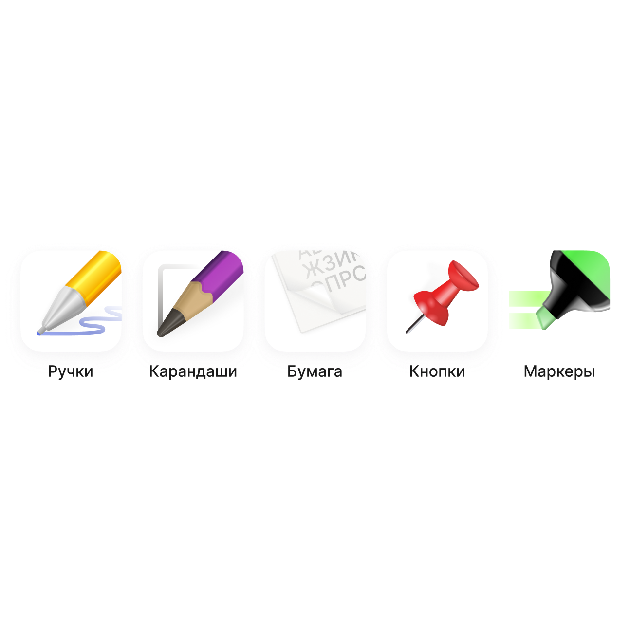
Iconography
During prototyping, it became clear that without a custom icon set, the interface would not function properly either visually or functionally. Using raster icons in such a product would immediately reduce clarity and scalability.
I started designing the icons from scratch. The first approach was unsuccessful — I underestimated the importance of references and system thinking. After additional research, I rebuilt the grid, optical weight, and icon logic, gradually refining them into a cohesive set.
Mascot
Since access to the original redesign materials was limited, the brand character had to be redrawn manually using only raster references.
This became a separate exercise in precision and attention to detail: preserving the character’s personality while aligning it with the unified visual style of the application.

Results
After a series of iterations, I arrived at a clean and functional solution. The tab bar was completely removed, navigation was reworked, and the readability of key screens was improved.
This project became my first complete mobile interface where I managed to combine brand colors, a mascot, custom iconography, and a thoughtful screen structure without a sense of visual overload.
Conclusions
This project became my entry point into systematic UI/UX design. It was the first time I went through the entire development cycle — from competitor analysis and business logic design to the final interface. It helped me understand in practice a key principle: design must solve product problems rather than simply consist of a set of screens.
Throughout the process, I focused on building a logical structure and justifying every visual decision. Experience with guidelines, iterations, and defending design decisions before a “client” laid a solid foundation. I learned to see the product as a whole and understand how information architecture shapes the final user experience.
Did you really expect something here?
